
Dashboard clutter is killing your insights. Here’s how I solved it with one Power BI trick.

A lot of dashboards I see across the internet are so packed with visuals that they become distracting, and users can barely read the tiny text.
As Data Analyst you start with good intentions to show everything important but end up with a dashboard that overwhelms rather than informs, and users miss the key insights buried in the visual noise.
But there’s a better way: Power BI has built-in solutions that let you display category breakdowns for each metric in a compact, readable format.
Here’s what this approach gives you:
Features:
- Dynamic metrics,
- Dynamic subcategory segmentation,
- Automatic title update,
- Comparison to target or previous period.
Benefits:
- Reduced cognitive load,
- Compact format,
- Mobile-friendly design,
- Maximum insight, minimum space.
The Implementation
First, let’s look at what we need. In this example, we have two groups of fields: metrics and subcategories.
Now we need to create field parameters for both groups. This is the powerful feature that most people overlook. Field parameters turn one visualization into dozens of different views.
Go to the Modelling tab >>> New Parameter >>> Fields.
Now add the metrics you want to track on this visualization.
In my case these are CPC, CAC, Revenue, and ROI.
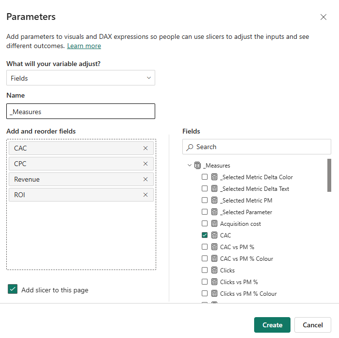
Select the Add slicer to this page option.
Now repeat the same for subcategories:
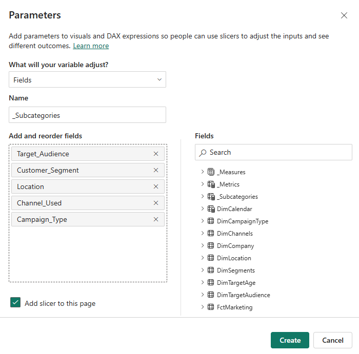
Once you create both parameters, a new tables will appear in the data bar on the right.
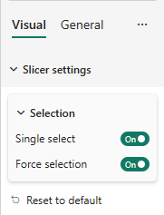
Change slicer types to button slicer and enable Single select mode with Force selection.
Let’s tweak the names of subcategories on the slicer.
Find the _subcategories field on the data pane. Here we will update the names:
_Subcategories = {
("Campaign Type", NAMEOF('DimCampaignType'[Campaign_Type]), 0),
("Channel", NAMEOF('DimChannels'[Channel_Used]), 1),
("Customer Segment", NAMEOF('DimSegments'[Customer_Segment]), 2),
("Target Audience", NAMEOF('DimTargetAudience'[Target_Audience]), 3),
("Location", NAMEOF('DimLocation'[Location]), 4)
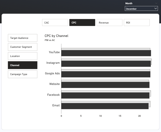
}After creating a clustered bar chart, drag the _metrics column to the X-axis and _subcategories to the Y-axis.
Now here’s where it gets really interesting. What if we could compare current data with previous periods automatically?
We are going to add another bar with data from previous periods.
For that we need a new measure using the SWITCH function. The SWITCH function allows us to choose a variable according to the selected field parameter:
_Selected Metric PM =
SWITCH(
    SELECTEDVALUE(_Metrics[_Metrics Order]),
    0, CALCULATE([CAC], DATEADD('DimCalendar'[Date], -1, MONTH)),
    1, CALCULATE([CPC], DATEADD('DimCalendar'[Date], -1, MONTH)),
    2, CALCULATE([ROI], DATEADD('DimCalendar'[Date], -1, MONTH)),
    3, CALCULATE([Revenue], DATEADD('DimCalendar'[Date], -1, MONTH))
)
Drag this measure to the X-axis on our bar chart. Now you see both selected and previous month values.
Let’s fix the title now. It should be updated every time we change a metric or subcategory. This measure would help us:
_Selected Parameter =
  MAX(_Metrics[_Metrics]) & " by " & MAX('Subcategory'[Subcategory])
The MAX function allows you to retrieve the selected value from both slicers.
We are going to use this measure to dynamically update the title on our bar chart.
Go to Title >> Text >> Conditional formatting and choose the Field value.
Find _Selected Parameter measure and click OK.
Enable the subtitle and type PM vs AC as we compare actuals versus the previous month.
Conclusion
The beauty of this solution is that it works with Power BI’s native functionality without custom visuals or complex DAX required. Your users get the full breakdown they need without the visual overwhelm.
Leave a comment below: what Power BI topic should I tackle next?