
Stop Creating Multiple Dashboard Pages: Display Variance and Trends in One Visual
A step-by-step guide to combine line charts with variance indicators using error bars

Here’s an uncomfortable truth: If your insight requires users to flip between pages, most of them won’t see it.
Dashboard designers often face a trade-off: pack many visuals into a single page, making navigation difficult, or create multiple pages that require users to switch back and forth.
The second approach introduces another problem: when users move to a new page, they often forget what they saw on the first. Human attention and short-term memory are limited, as numerous studies confirm.
A practical way to address this challenge is to use error bars. By adding another dimension to a visual while staying aligned with one axis, error bars let data analysts present more information within the same chart, reducing the need for multiple pages and keeping users focused on a single view.
How do we make this work in Power BI?
The first step is to make sure to have a Data table in our Data Model. Without it, your measures won’t work.
DimCalendar =
ADDCOLUMNS(
CALENDAR(DATE(2023, 1, 1), DATE(2024, 12, 31)),
“Year”, YEAR([Date]),
“Quarter”, “Q” & QUARTER([Date]),
“Month”, FORMAT([Date], “MMMM”),
“ShortMonth”, LEFT(FORMAT([Date], “MMMM”), 3),
“MonthNumber”, MONTH([Date]), // New: Month number 1-12
“Week”, WEEKDAY([Date], 2), // Existing: Mon=1, Sun=7
“WeekdayNumber”, WEEKDAY([Date], 2), // New: clearer name for weekday number
“Day”, DAY([Date]),
“FiscalYear”,
VAR FiscalStartMonth = 7 // July is the 7th month
RETURN
IF(
MONTH([Date]) >= FiscalStartMonth,
YEAR([Date]),
YEAR([Date]) - 1
),
“IsWeekday”,
IF(
WEEKDAY([Date], 2) < 6,
“Yes”,
“No”
),
“FiscalMonth”,
VAR FiscalStartMonth = 7 // July is the 7th month
RETURN
IF(
MONTH([Date]) >= FiscalStartMonth,
MONTH([Date]) - FiscalStartMonth + 1,
MONTH([Date]) + 12 - FiscalStartMonth + 1
),
“ShortWeekday”, FORMAT([Date], “DDD”) // Short weekday name (e.g., Mon, Tue)
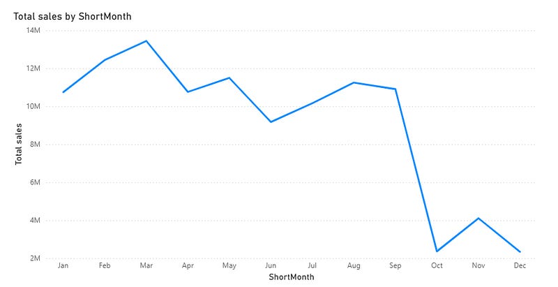
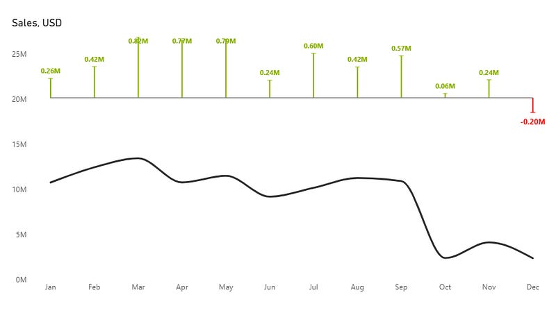
)Let’s start by creating a simple line chart using the Sales and Month columns. In this example, we’ll focus on spotting monthly trends to see how sales change over time.
Now, let’s tidy things up a bit.
Next, we’ll create a few measures and place them on the secondary Y-axis. We’ll use these later to add the error bars.
Neg_bar = 0Pos_bar = 0Create three measures: one to calculate the difference from the previous year, one for positive values, and one for negative.
Sales_Delta =
VAR CY = [Total sales]
VAR PY = CALCULATE([Total sales],SAMEPERIODLASTYEAR(DimCalendar[Date]))

RETURN
    PY - CY
Negative_delta = if([Sales_Delta] <= 0, [Sales_Delta])Positive_delta = if([Sales_Delta] > 0, [Sales_Delta])After that, go to Analytics → Error Bar. Select the positive bar, enable it in the options, and drag the Positive_delta measure to the Upper bound.
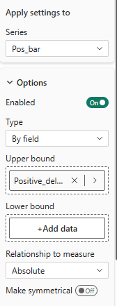
Next, select the negative bar, enable it in the options, and drag the Negative_delta measure to the Lower bound.
You’ll see both the line chart and the error bars, but they overlap. To fix this, move the variance to the top by adjusting the height of the main and secondary Y-axes.
Create two more measures.
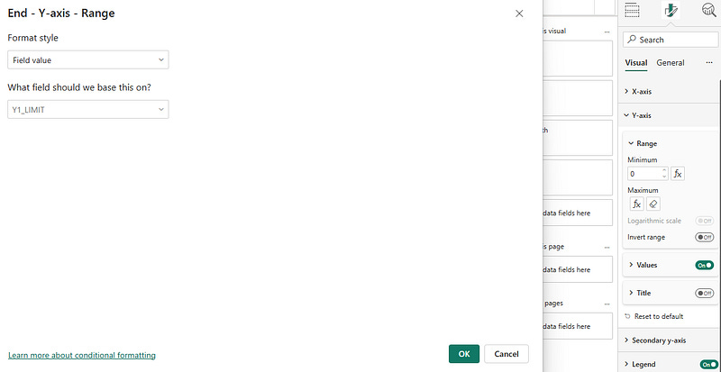
Y1_LIMIT =
MAXX(ALLSELECTED(DimCalendar[Month]),
[Total sales]
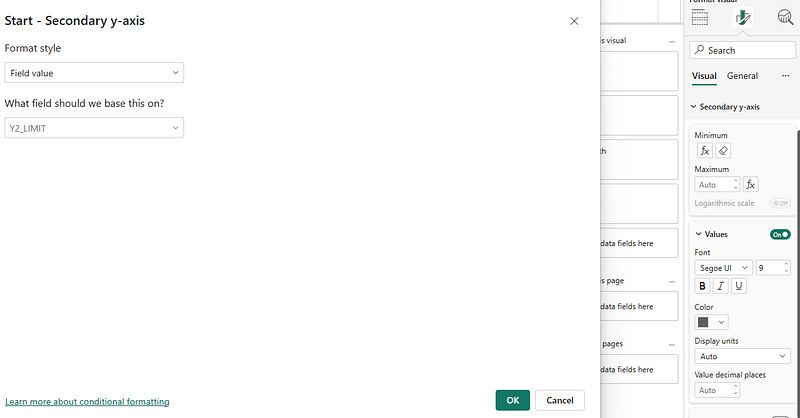
) * 2Y2_MIN_LIMIT =
MAXX(ALLSELECTED(DimCalendar[Month]),
ABS([Sales_Delta])
) * -3The first measure serves as the main Y-axis maximum value. The second measure establishes the secondary Y-axis minimum value.
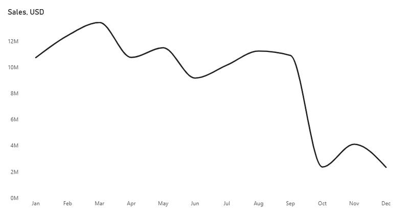
Our chart now looks like this:
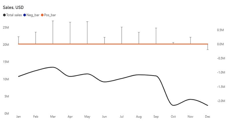
Format the chart by removing all secondary Y-axis values first.
Next, navigate to the lines section and disable either the negative or positive bar series.
Adjust the color and width of the remaining series.
Disable the legend.
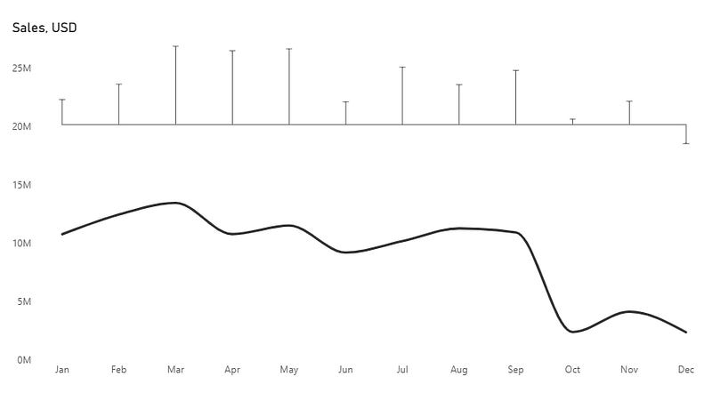
Change error bar colors based on differences from the previous month. Navigate to the error bars section and select the Pos_Bar series.
Set the bar and label color to #8cb400 (green).
Repeat the process for the Negative bar series, and set the color to #ff0000 (red)
That looks better, but some of the values overlap the error bars.
We should tweak the measure we created for the secondary axis.
Y2_MIN_LIMIT =
    MAXX(ALLSELECTED(DimCalendar[Month]),
    ABS([Sales_Delta])
    ) * -10
Add a new measure that we could use as the secondary axis max value.
Y2_MAX_LIMIT =
MAXX(ALLSELECTED(DimCalendar[Month]),
ABS([Sales_Delta])
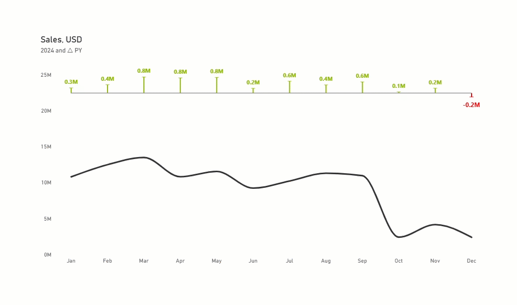
) * 2Add a subtitle, using a measure, to make it more descriptive and interactive:
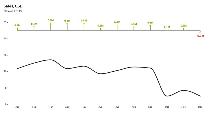
Subtitle = MAX(DimCalendar[Year]) & “ and △ PY”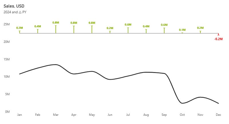
We made final tweaks to the formatting and added a tooltip.
Here is the final result:
You can find all materials and PBIX file here: Link
Want to boost your visualization even more? Enable switches between different measures and comparison metrics using the Field Parameters. Check my previous article for step-by-step details.
If you are interested in this, write in the comments what you want to see next.
Become part of a community that values clean design and happy users. Subscribe for exclusive Power BI insights.