
Stop the Spaghetti Monster! Transform Messy Line Charts with This Power BI Trick
Multiple categories make line charts unreadable. Learn the technique that brings focus back.

There are often many subcategories on our visualization.
We want to display data over time with the line chart. However, what happens when we have 5, 10, or 15 lines? It becomes difficult to read and compare. What options do we have? In the data storytelling community, there are a few approaches: split the line chart, create a new one for each line, or modify the visualization.
First option comes with a disadvantage: it would take considerable space in our dashboard. Keep it in mind.

If you have static data, this might not be an issue, as you can create an extra slide in your presentation or a new chapter in the story.
However, what if the data is dynamic?
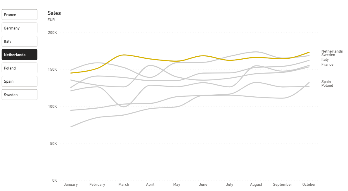
In our dashboard we might use the highlight method: we gray out all the lines except the one we want to bring attention to. We will allow our dashboard users to choose a specific category and examine the trend.
Let’s look at what we can do with standard Power BI features.
How to create that?
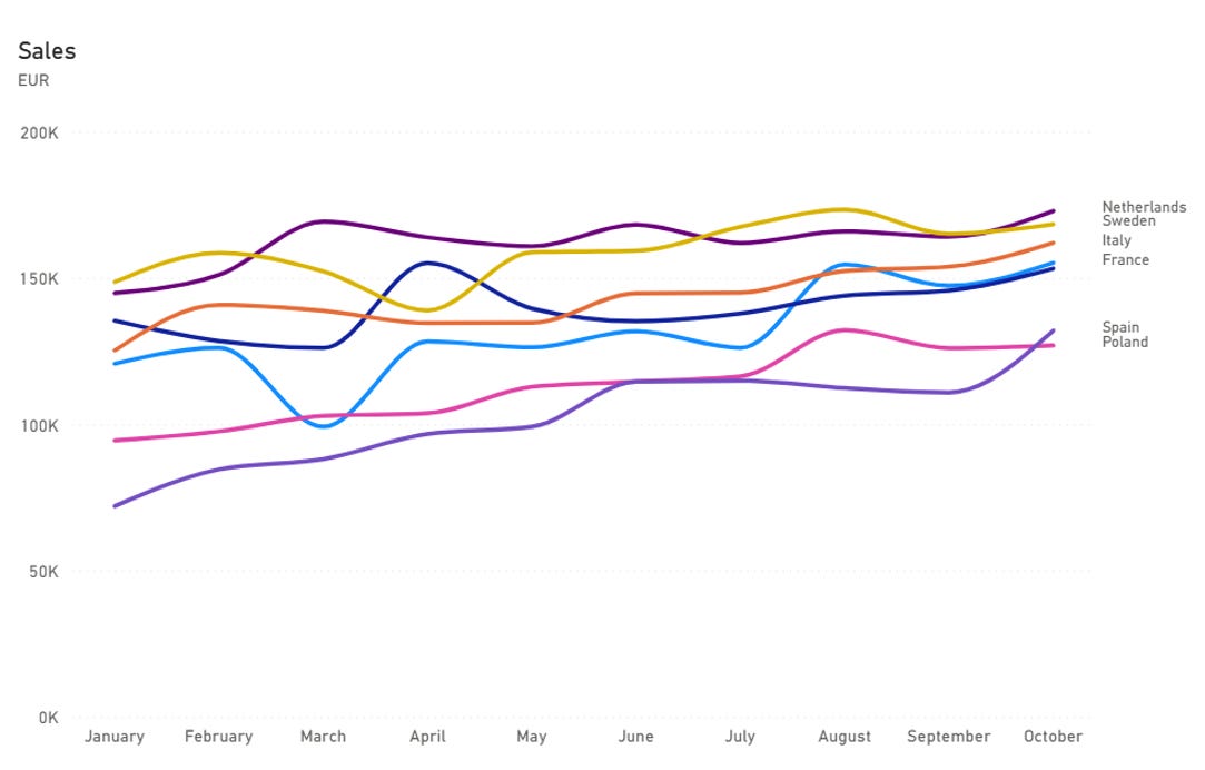
Start with a line chart:
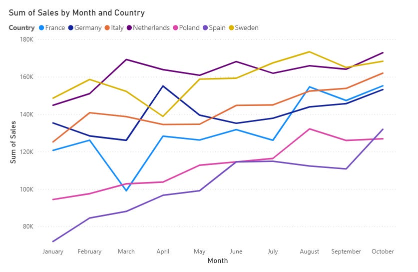
This looks terrible and cluttered: many lines with different colors. It’s difficult to concentrate.
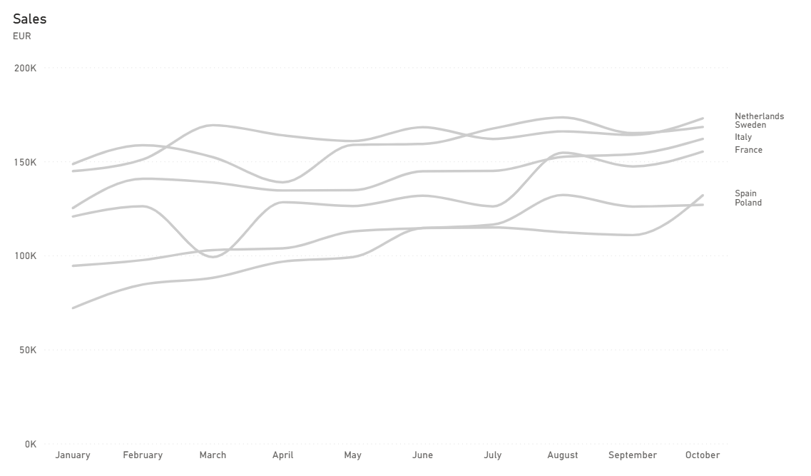
Let’s clean it first:
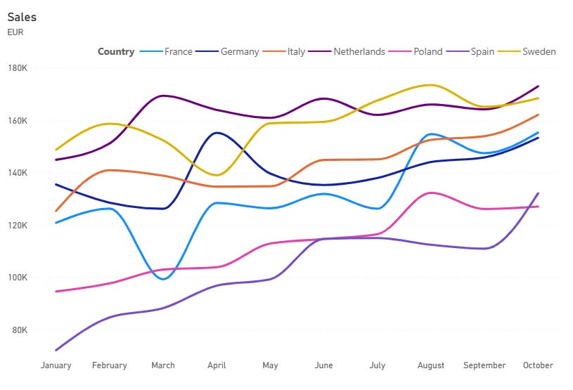
Disable the legend and enable Series labels.
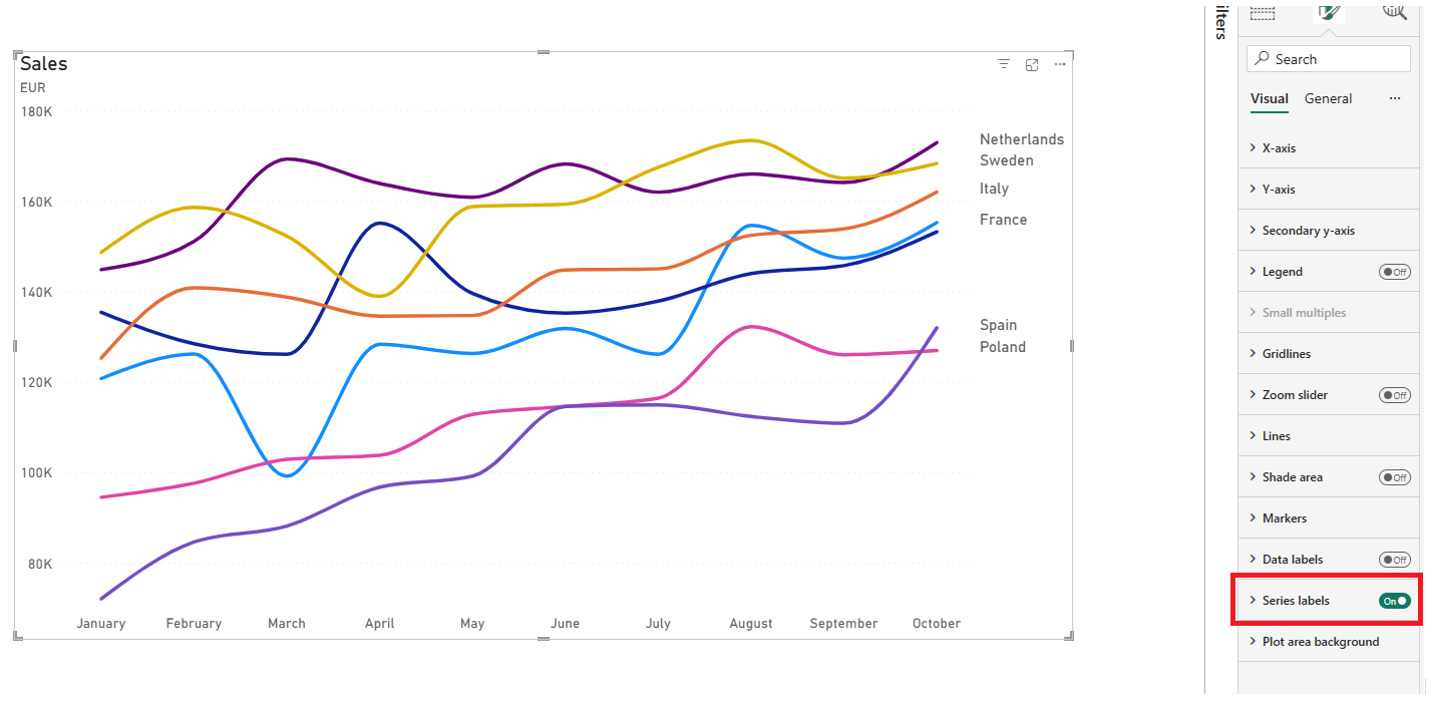
As you can see, Series labels are limited to 6 items, and the Germany is not visible here even when you try to lower the font size.
Set the Y-axis minimal value to zero. Create the measure and use it to limit the maximum value:
Mx value = MAXX(ALLSELECTED(’Dataset’), ‘Dataset’[Sales]) * 1.2We want to see the true picture without zooming in.
There is still too much clutter, and we still want to change the color of the lines.
Unfortunately, we cannot use measures to do that, and it will work only with a limited number of categories.
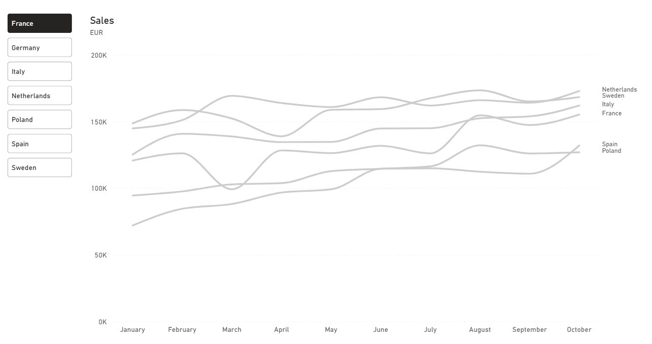
We will create a measure for each category. In our case, one measure for each country:
Netherlands = CALCULATE([Sales], ‘Dataset’[Country] = “Netherlands”)We do this for all countries on this chart.
Remove the Sales measure from the chart and replace it with these Country measures. Format all those lines as gray.
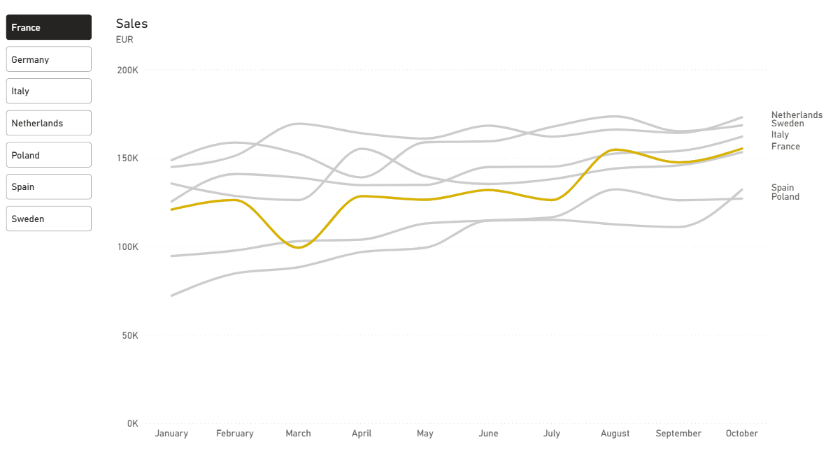
Now our chart looks like this:
To highlight the specific country, we need a disconnected table with the list of countries.
Go to Modeling → New table and enter this DAX code:
Country Selector =
DISTINCT (’Dataset’[Country])
Drag the Country Selector table to our page and set the type to Button Slicer with the Single Select option.
Next, we want to highlight the selected country.
Create a new measure:
Selected country =
CALCULATE(
    [Sales],
    ‘Dataset’[Country] = SELECTEDVALUE(’Country Selector’[Country])
)
Add this measure to the secondary Y-axis.
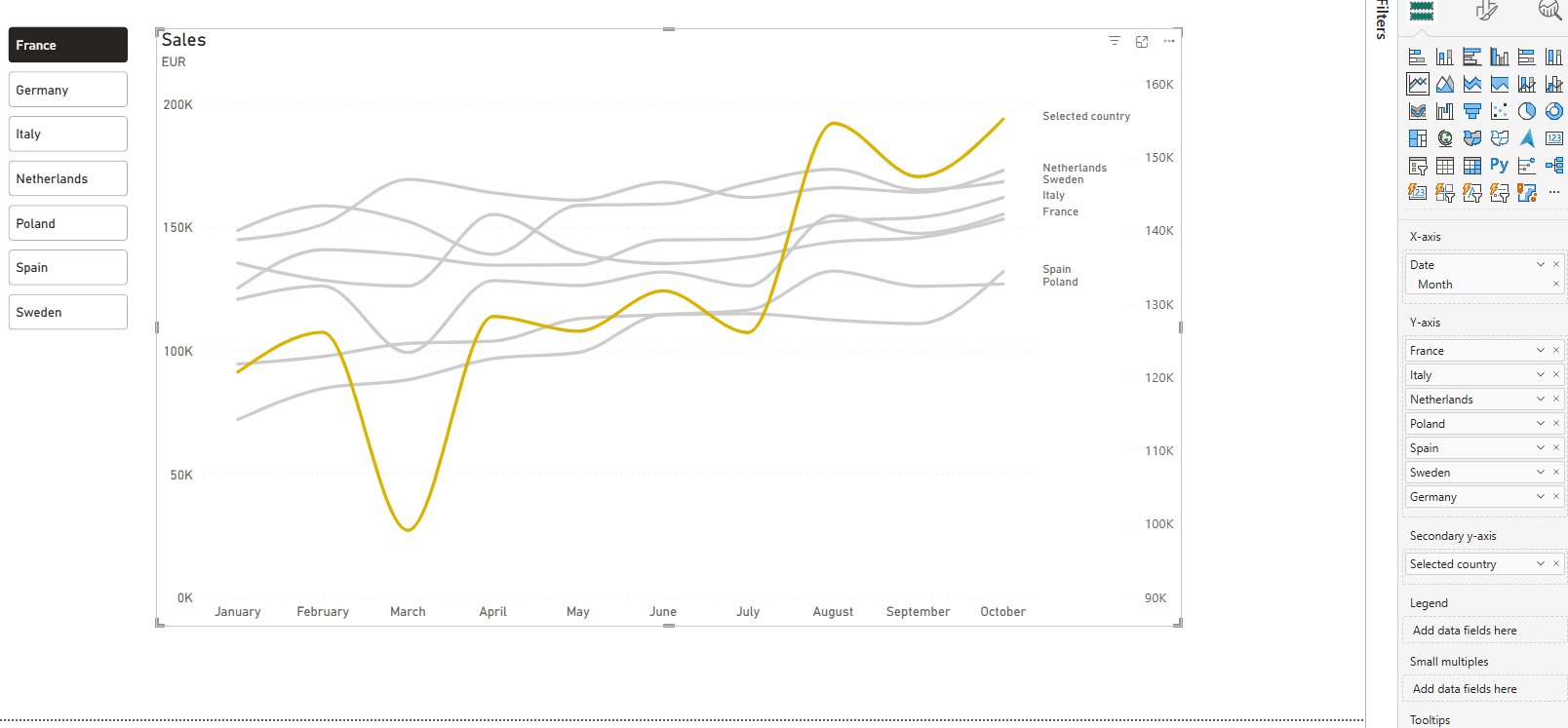
The Selected country line shows different values.
To fix that, we need to adjust the secondary Y-axis, setting the minimal value to zero and the max value using the Max Value measure we created before.
After that, disable the secondary Y-axis values.
The default tooltip is showing too much information:
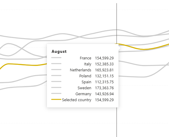
The best approach here is to focus only on the selected period, country, and average value across the entire dataset.
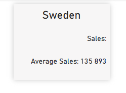
We are going to create a new page and set the Canvas Settings Type to tooltip. Create a measure for the selected country name:
Country = max(’Country Selector’[Country])measure for selected month values,
Country sales =
FORMAT(SELECTEDVALUE(’Dataset’[Date]), “mmmm”)
& “ Sales: “
& FORMAT([Selected country], “# ###”)
and average sales.
Average sales =
“Average Sales: “ & FORMAT(AVERAGE(’Dataset’[Sales]), “# ###”)
Drag those measures to the tooltip page and set the visualization type to Card(new) and disabling the labels.
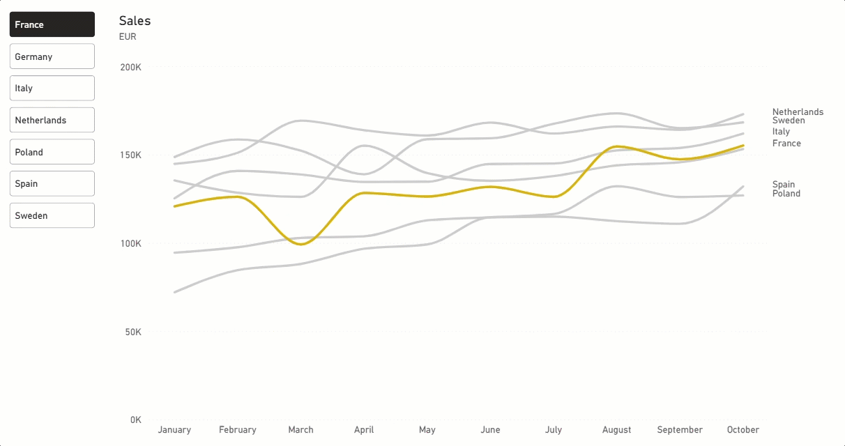
Move back to the first page and select our spaghetti chart.
Go to the Tooltips section and select our tooltip as Report page.
The result.
Final thoughts
This is a good method to show the compact line with multiple categories without losing the overall context and having the attention focused only on one thing.
The limitations: currently Power BI is able to display only 6 categories labels max.
Keep that in mind. If you want to untangle more spaghetti, try to group your categories and create a separate chart for each one.
You can find a dataset and PBIX file by following this Link.
Thanks for reading! If you want more practical Power BI content, subscribe and join the BIWave community.
Which visualization problem are you struggling with?
There is much to learn here about focus on the information that matters.